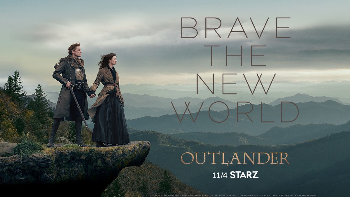
OUTLANDER Season 4 key art!

STARZ released the official OUTLANDER Season 4 "key art" today! This is the promotional image that will be used to advertise Season 4.
Here are a few of my first impressions:
- The mountains in the background could certainly be North Carolina's Blue Ridge Mountains, though they don't look blue in this light. (For comparison purposes, here's a photo of the mountains near Asheville, NC, not too far from where Fraser's Ridge is supposed to be located.) That's not a complaint. Given the overall effect they were going for, it wouldn't make sense to show the mountains in full sunlight. They are definitely recognizable, though, which counts for a lot, if you ask me.
- Jamie has traded his sword and dirk for a musket. That's very appropriate!
- J&C are holding hands. <g> That signals to me that all's right with their relationship this season, that there won't be so much conflict between them as we've seen in the past. (At least I hope so!)
- The overcast skies are somewhat foreboding. There's danger ahead. "Brave the New World" gives that impression, too -- settling in North Carolina will be a risky venture, full of unknown dangers and situations they've never faced before. The whole picture does a good job of portraying that.
- My sense is that they're looking toward the future -- but they're also standing on a precipice, and it could collapse at any moment. IMHO that's not a bad image for this point in the story, where they are starting on this phase of their lives with hope and optimism, but also with the knowledge that war will be coming within a few short years.
Kudos to the STARZ team! I think they did a good job with this. What do the rest of you think?


Comments